The design of the ad images has a significant influence on your success with LinkedIn ads. It decides to a large extent whether your ad will be noticed and whether the user will click on it. But how should an ad image for LinkedIn ads be designed? What are the right formats? Which colors should you choose and is it advisable to use fonts? In this blog article, you’ll learn what you should consider when designing your ad images for LinkedIn ads.
You’ve probably seen a post or two on social media that doesn’t follow the format requirements of the channel. In such posts, the images can look blurry or pixelated, or there are unsightly margins on the sides.
LinkedIn ads offers different ad types, each with specific format specifications:
Single Image Ads can be created horizontally, vertically or in 1:1 format.
However, the following specifications are recommended:
Recommended size: 1200 × 627 px (max size 7680 x 7680 px, min width 400 px)
Maximum file size: 5 MB
File type: JPG, PNG or GIF (animated GIFs will be converted to static ones)
Recommended size: 300 x 250 px
Maximum file size: 40 KB
File type: JPG, PNG or GIF (not animated)
Recommended size: 100 x 100 px, aspect ratio 1:1
Maximum file size: 2 MB
File type: JPG or PNG file
Recommended size: 1080 x 1080 px, aspect ratio 1:1.
Minimum 2 cards, max. 10
Maximum file size: 10 MB
File type: JPG, PNG or GIF (not animated)
Just like single image ads, video ads can be created in three different formats. Either vertical (9:16), landscape (16:9) or square (1:1). Unlike static images, however, there are fixed format specifications for video ads. However, it is important to note that videos with a vertical aspect ratio are only displayed on mobile devices that support a vertical video player.
Recommended sizes:
File size: 75 KB to 200 MB
File type: MP4
The color scheme of your LinkedIn ads ad images will largely determine whether your ad stands out from the crowd of posts or gets lost instead. Since the LinkedIn platform is primarily designed in white, gray and a little blue, you should choose colors for your image ads that clearly stand out from the background. If possible, match the colors to your corporate design for greater recognition.
Are there certain colors that work best for Linkedin ads images? Some marketers believe that the colors red, green and orange work best. However, this certainly depends on many factors such as the product and the target audience.
Should you add type to your Linkedin Ads ad images? There is no one-size-fits-all answer here. Ultimately, as with all digital marketing questions, you need to test what works best for your specific offering and target audience..
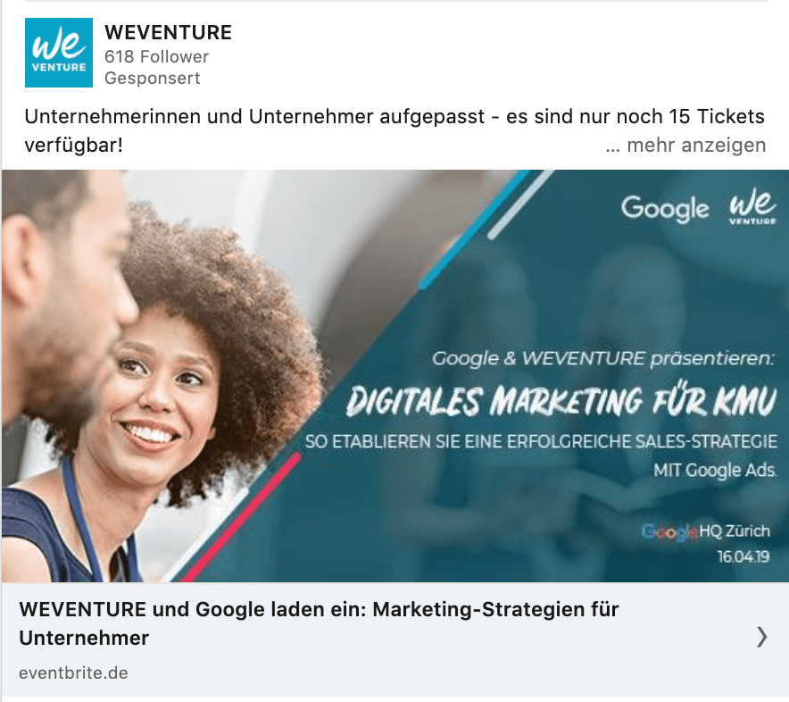
If you are using type, however, it is advisable not to overload the image with too much type: As a rule of thumb, you can cut down to one title, one subtitle, and one CTA, as in the example of this ad from Salesforce.

Conclusion: For the ideal LinkedIn ads image, be sure to use the correct format. Depending on whether you choose an image, a video, or even a carousel, use the format that’s recommended for that ad type. Choose colors that stand out and match your branding, and test whether the combination of your image and type appeals to your target audience.